Branding uses the psychology behind colours to create visual elements that make up the corporate or brand identity of a company, showing what it stands for and highlighting its values.
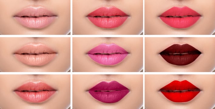
In your catalogues or online stores, colour can guide your customers’ eyes to what's important in the image and focus attention to react emotionally without being aware of it. It’s why it’s so important that your images are as near to the real thing as is possible in the digital process. Professional retouching has never been more important, critically in the areas of fashion and lifestyle. Photographers and retouchers at ec2i are experts at shooting and colour matching products to create perfectly balanced and attractive images.
In this article, one of our ec2i colleagues, Pawel, a passionate photographer and retoucher, provides his take on the grammar of colour.
Colours shape our very first experience in the world. We see colours before we can speak to name them. We develop our cultural indoctrination to respond to colour in a certain way. We use colour as a storytelling device, but still, we don't recognise colour as a language. Colour as a language to communicate mood change, feelings or selling stories is a mighty instrument. It helps to formulate messages to communicate with people and explore the frontiers of communication effectively. How would it be if we learn a grammar of colour to form the proper conscious decision of how colour could represent us to enrich our relationships with the environment in which we live?
However, in colour theory, there are no set guidelines to say how to use colour.
Colour theory is a set of principles used to create harmonious colour combinations to create a pleasing image. The basic is that we have some colours that go well together, and some that don't. Colour relationships can visually represent a colour wheel - the colour spectrum wrapped onto a circle.
Human nature has that kind of instinctual trait to take advantage of any evolutionary development which shapes our psychology.
- Primary colours like red (as in blood and fire) express energy, war, danger, strength.
- Blue is a domain of water and sky and often specifies depth and stability. It symbolises trust, loyalty, wisdom and confidence.
- Yellow is the colour of sunshine representing joy, happiness and intellect.
You can mix them to create secondary colours and additional gamma of emotion.
Colour retouching exploits RGB and CMYK colour spaces to measure colour values, analysing image colours through inter-channel interference, focusing on balance with selective colour adjustment. Computer’s software can present colour value in numbers. However, beyond those numbers, there is that emotional effect that can have a massive impact on your audience. Hence, technology can't replace human judgement over the final visualisation and colour interpretation.
ec2i can support you through your image journey to achieve the sales results you want…take a look at the services we offer and get in touch for a free test and quote.