Product Colour Management
Ensuring your products are accurately replicated across your sales channels
Our solutions deliver
colour consistency and accuracy
for every project, ensuring your online
and offline marketing showcases
your products in the
best possible way.
Brands use a wide array of technologies to create amazing ads that communicate with their target audience. Naturally, they expect the colours of photos in print to precisely match those in a digital format.
However, not every device or bit of software used in the production process interprets colour in exactly the same way. That means an image or packaging displayed on a web page can look very different to one in print.
Our expert team and product colour management solutions ensure this will never happen to you.

What is colour management?
Colour management is the process used to guarantee the displayable colours in any image are exactly the same - no matter how or where they are viewed.
Our solutions deliver colour consistency and accuracy for every project, ensuring your online and offline marketing showcases your products in the best possible way. No disappointed audiences or returned orders.
Instead, customers will enjoy the same high-quality image, whether they’re checking a catalogue’s fine print or scrolling their smartphone.
Who benefits from consistent colour management?
Colours in a photograph can be represented across a wide range of different devices, from scanners, digital cameras and computer printers to offset presses, tablets and TV monitors.
Yet it’s not just the photographer who has worked hard to produce a perfect image for a brand that will benefit from consistently controlled .
Almost the entire supply chain reaps the rewards, from designers and buyers right through to the final customer.
But how do we ensure a digital and print colour looks the same on every device?
The primary steps of product colour management
The digital age has brought with it a variety of ways for us to enjoy images, but not all devices speak the same language.
That can lead to variations in the way they read and interpret colours, leading to variations in the final output, be it print or digital.
Colour profiles
To ensure colours are accurately reproduced across technologies, the International Colour Consortium (ICC) colour profiles were created.
These ‘instruction manuals’ are available for specific makes and models of cameras, printers, monitors and paper. They describe how a particular technology represents colour and translates it to align with other devices.
Here’s an example: if you use a digital camera to take a photo, you can link the ICC profile for the particular device to the image.
When printing, the colour management system converts the colour information captured from the camera’s sensor into the profile connection space (PCS).
The printer then uses the ICC profiles to convert the photograph data from the PCS into its colour space, enabling the final output to be printed as accurately as possible.
Aligning colours using gamuts
Different devices produce a wide range, or gamut, of colours.
While there are some overlaps, not every shade displayed on a professional monitor with a broad colour gamut can be replicated on a laptop or monitor.
Likewise, a printer won’t be able to recreate the colours seen on a computer screen. This is due to the specified range of displayable colours, known as the colour space.

Colour space examples
CMYK
Cyan-Magenta-Yellow-Black, also known as CMYK, is the colour scope used in the print industry.
The combination of these four inks produces everything you see in magazines, newspapers, direct mail, catalogues and flyers, to name but a few.
Known as a ‘subtractive’ colour space, it creates colours by removing one or more from the mixture.
RGB
Red-Green-Blue, also known as sRGB, this colour space is for digital images, and is akin to Adobe RGB and ProPhoto RGB.
Despite having a smaller range of displayable colours than its Adobe and ProPhoto cousins, sRGB is considered the digital standard for computer displays, as well as mobiles and tablets.
Adobe RGB
This has a wider range of blues and greens than sRGB, and is only used for printing.
ProPhoto RGB
This is the largest colour space, and was created by Kodak to mirror the vast range of shades seen in real life.
CIE LAB
This colour space is reputed to include all the shades visible to the naked eye, and includes the RGB variants.
When you’ve selected your colour spaces, it’s important to then create the right file formats for your images.
File formats and colour management
The most common image file formats are JPEG, TIFF and RAW. They determine how the photographer’s camera collects information when taking a picture.
JPEG (Joint Photographic Experts Group)
This is the best format for final product images as it is compressed, processed and ready to use. JPEGs also take up less space and are perfect for sharing on social media.
However it’s worth noting that overexposed or underexposed information - known as clipped - will not be recoverable.
TIFF (Tagged Image File Format)
This format is the best to use if an image still needs retouching, and is a compromise between RAW and JPGs.
Perfect for printing, it is supported by a range of editing programs and no data is lost when images are compressed.
RAW
This format captures the maximum amount of data from an image, offering the most flexibility in post-processing and a dynamic range.
Although it doesn't compress or process an image before saving it, RAW photos also don’t hold any colour information. It is the best option for professional photographers.
For RAW files that have been processed or retouched, it is best to save as TIFFs for large format use, before being saved as JPEGs for lower-resolution projects.

Calibration and colour accuracy
Monitoring colour calibration is an absolute must for good colour management.
We understand colour accuracy will differ between different output devices because you can’t control the way someone else’s phone, tablet or monitor displays images.
However, you can ensure it is accurate when viewed in a colour-managed, light-controlled environment.
Having regular monitor colour calibration checks will certify that you’re looking at the true colours of a particular subject, rather than potentially incorrect shades.
A non-calibrated monitor can lead to colour inconsistencies when printing images or even when viewing projects on another computer monitor.
Our eyes naturally adjust to non-calibrated colours over time but with regular monitor colour calibration, this can support your colour management system and give you more control over what you see on the screen, post processing.
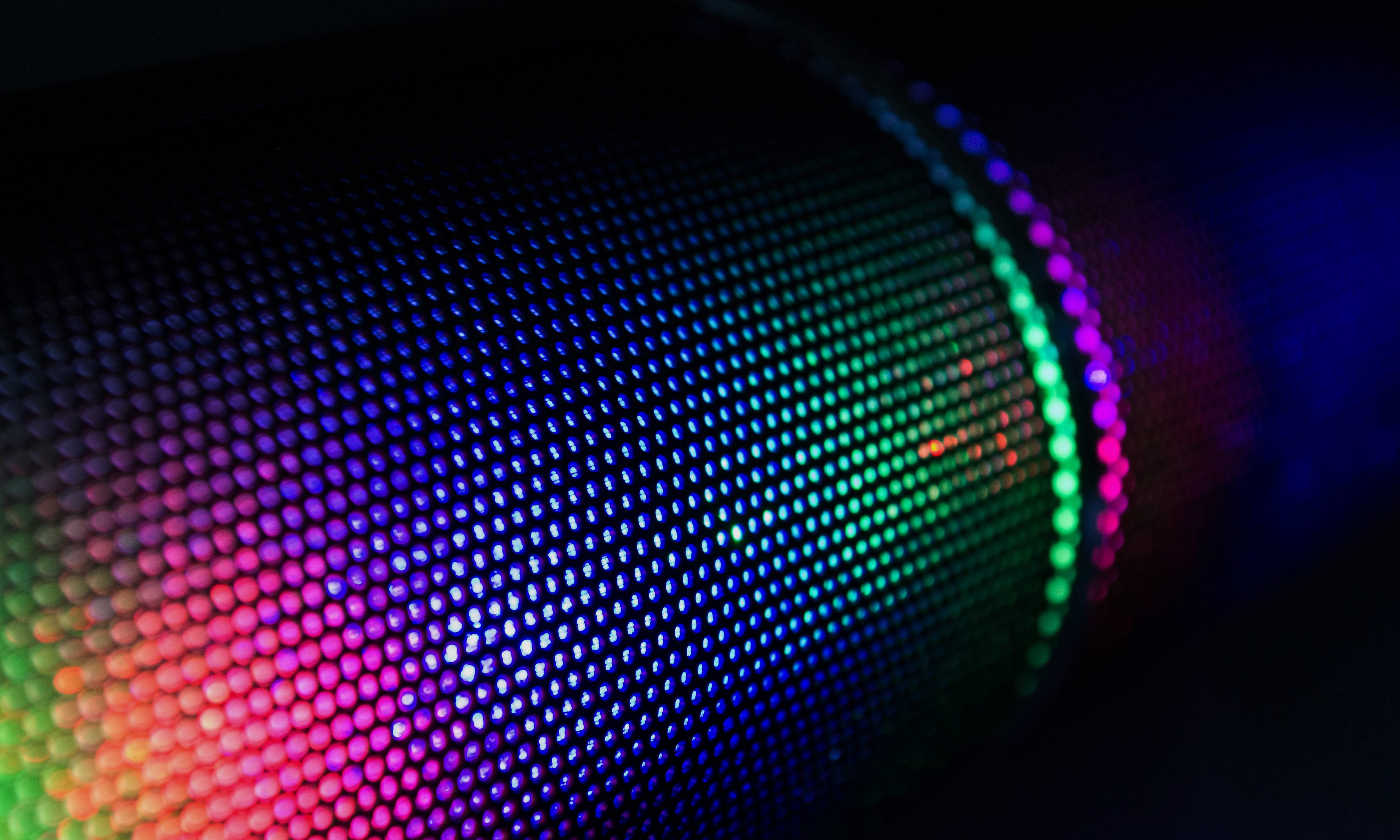
Uniformity on any device
This is the way colours are distributed on a monitor screen. Poor uniformity will result in an uneven distribution of colours and luminance.
For example, a finished product may appear brighter in the middle of the screen than around the edges, or with exaggerated blue hues in one corner than another, which may not be easily noticeable to the human eye.
Monitoring calibration ensures the full range of colours and luminance of images on web browsers or mobile phones are correctly and evenly distributed at all times.
To check all is well, it’s worth importing a photo from a desktop computer to a smartphone, laptop, tablet and television to compare and contrast any potential variations.
Maximise your viewing environment
Your colour management accuracy can be affected by where work is being done. Distractions including brightly coloured furniture and ambient lighting conditions can make it harder to edit projects.
Instead, we recommend creating an ideal viewing environment.
Solutions include using a monitor hood to minimise light reflecting on your screen, deploying an IPS panel to maximise viewing angles, and choosing neutral colours for your office decor.
Our four key components of product colour management
- A highly skilled and experienced retoucher
- Adobe Photoshop program
- A calibrated monitor screen
- An industry-standard light booth
We also use industry-standard proofing solutions from GMG to guarantee accurate colour conversion from one colour space into another.
It is designed to deliver the most accurate results, achieving consistent colours on a range of substrates, using different prepress and printing processes, together with proof profiles and software solutions.
This useful tool works seamlessly alongside our prepress services and ensures our customers’ production demands are always met.
Advice, equipment and more
We don’t just provide high-quality colour management services and expertise. Our team can also provide internal colour management workflow advice, as well as solutions to any issues you may have.
We can also set you up with all the equipment designed specifically for colour management and professional creative projects to create the perfect working space.
That includes supply and fit of various devices such as many monitors, light booths and hardware calibration, as well as useful tools under our media production management system.
It features streamlined workflow functionality and software calibration for image management and team collaboration, and is ideal for working at a central office or remotely.
Why choose ec2i?
We have more than 20 years of photography and business experience that we bring to each image for every project.
Coupled with our passion for the shooting process, including the client in the editing process as part of our bespoke workflow solutions, we guarantee every business will get amazing shots, on time, on brief and on budget.
Ready to get started on your next ecommerce photography campaign?
Call us on 01702 541311, email info@ec2i.biz or use the contact us button below, and we’ll get back to you straight away.
For all your photography shoots, whether that be for print,
web or e-comm deployment, we enhance and capture your products accurately with a touch of flair.
WE COMMUNICATE YOUR MESSAGE, ENHANCE YOUR BRAND AND SMOOTH YOUR PRODUCTION PROCESS
Over 20 years of seamless business continuity is behind the company we are today and with a massive wealth of experience and knowledge to share with your team and brand, we ensure your project is completed on brief and on budget.
There is a can-do attitude that resonates through the very fabric of our company and with in-house R&D teams who spend their time developing and road-mapping our latest products and workflows to ensure that we offer the very latest production solutions to our clients. Our Renaissance complete workflow solution enables our clients to capture, create, manage and deploy their media content in one end-to-end platform. It’s bespoke and totally tailored to your production needs.
www.ec2i.biz